Branding & Web Design: New Work in Rural Areas
OAC Spaces (Offices and Co-Working) develops building and usage concepts for rural areas, transforming vacant and underused spaces into new places of work such as coworking, offsites, living, and overnight stays. OAC Spaces stands for modular operating and construction concepts. Across (Eastern) Germany, buildings in structurally weak regions are to be converted or newly constructed in a climate-neutral way.
Modular Brand
SInnovation and transformation projects that stimulate rural development are exactly why we founded uberneu. We were therefore particularly excited about the opportunity to create the brand identity for OAC Spaces. This allowed us to give the project an appealing and convincing identity from the start, helping to set it up for success. It was a challenging branding task aimed at winning over both investors and, later, digital workers, remote teams, companies, and tourists alike.
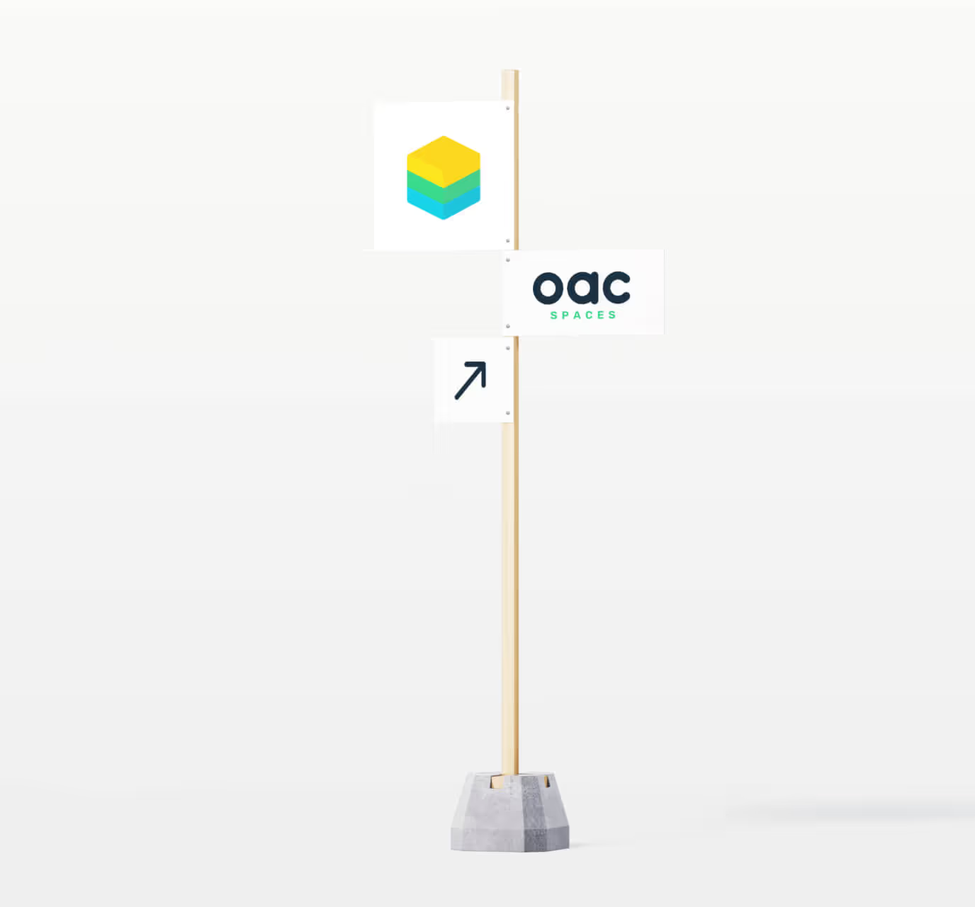
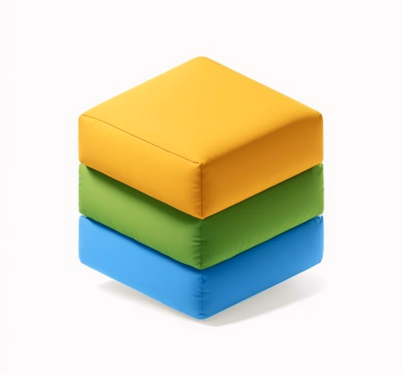
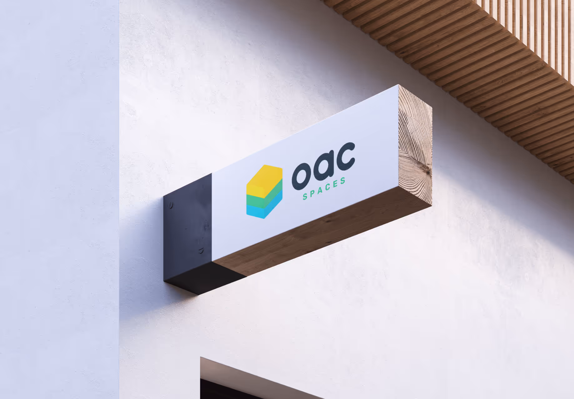
The modular construction method and rural setting became the core inspiration for the logo design. A rounded square represents the form of a building, combined with three modular colors: yellow for sunny hearts and creativity, green for meadows and forests, and blue for the many lakes and rivers of Eastern Germany. The custom-designed OAC Spaces typeface continues the rounded-square shapes, conveying friendliness and playfulness. The result is a brand that has stood out and convinced audiences since 2021.
Modular Website
In 2024, we further developed the OAC Spaces brand at uberneu by designing a website aimed at attracting and informing potential investors. The branding was carried forward into a lively and informative homepage that presents OAC’s innovative rural concepts while highlighting investment opportunities. We wish the project great success and look forward to continuing to accompany OAC Spaces on its journey – and hopefully to visiting one of the locations in the near future.


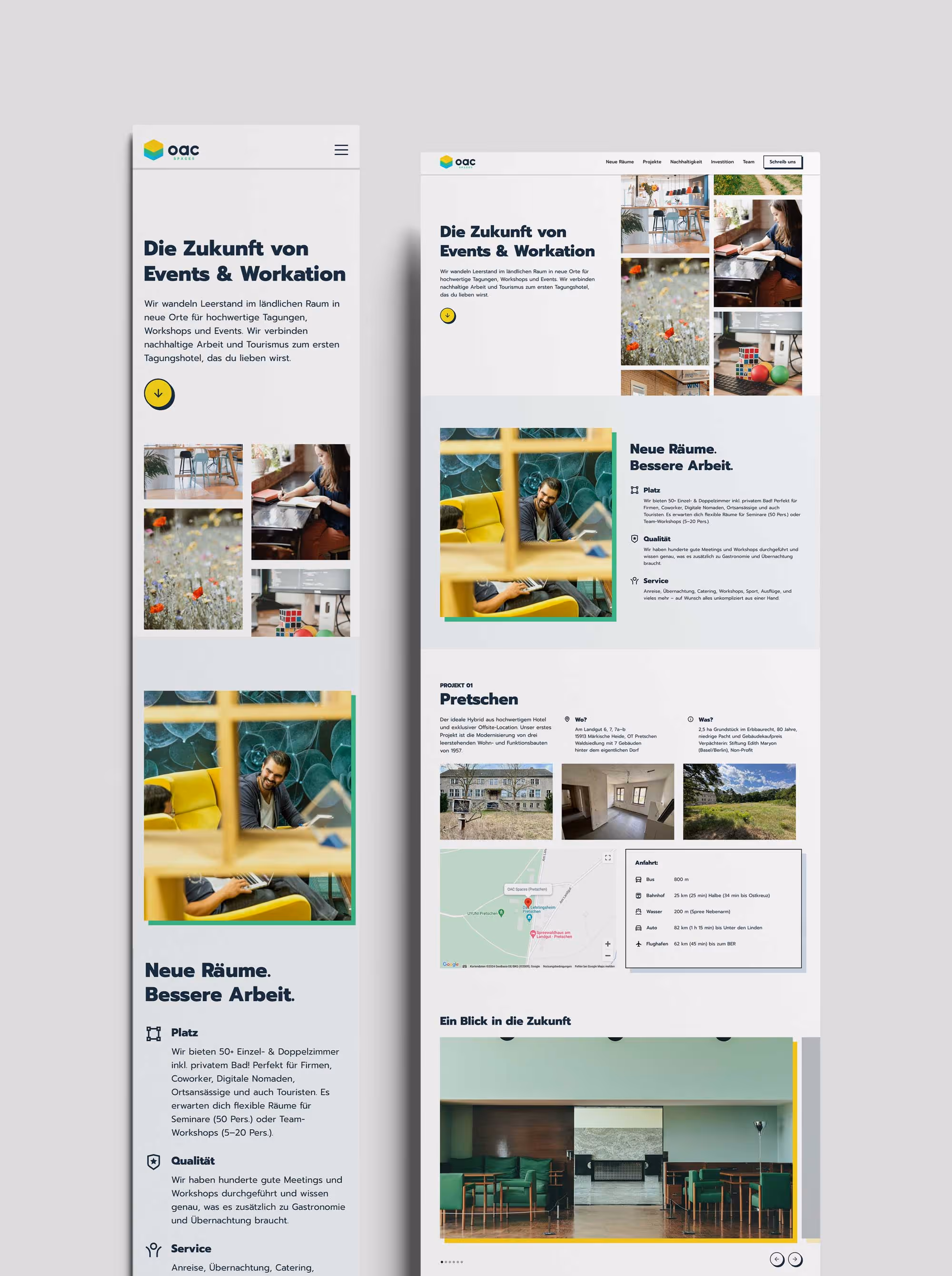
On Mobile and Desktop: Always a Great Outlook for the Future